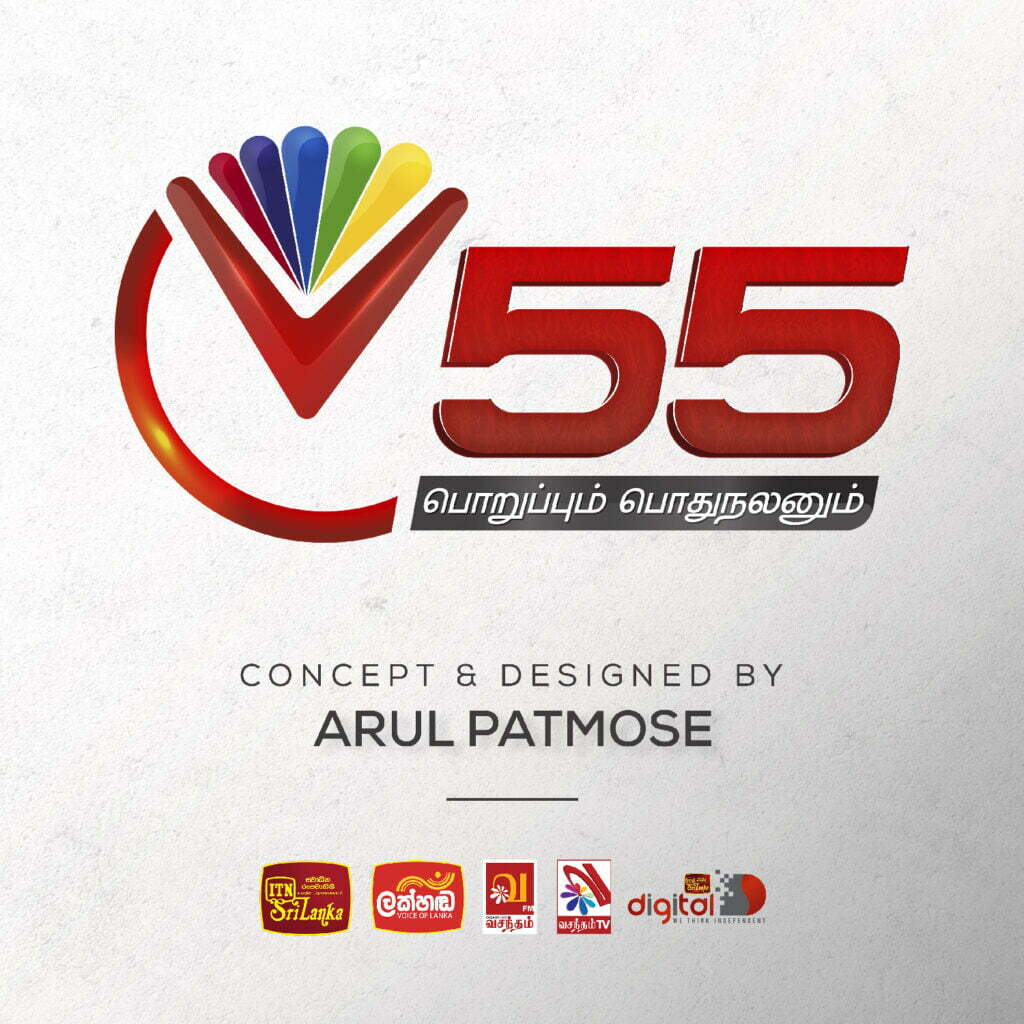
V55 Logo Design for Vasantham TV
Project
Design a logo for a Sri Lankan Tamil digital television channel, with a unique element reflecting the channel’s news focus.
Design Analysis
The V55 logo combines color, shape, and typography to create a memorable and informative brand identity. Here’s a breakdown of the design elements:
Colors
The logo uses two primary colors: red and white. Red is associated with excitement, passion, and action, aligning well with news programming. White provides a clean background.
Rainbow
The rainbow symbolizes hope, optimism, and diversity, suggesting Vasantham TV offers a variety of programming with news being a prominent focus.
Typography
The letter “V” is displayed in white with arms resembling clock hands pointing to the 55th minute. This integrates the channel’s name and news schedule (bulletins airing at the 55th minute of the hour). The number “55” is displayed prominently next to the “V”.
Strengths
- Memorable: The rainbow’s vibrant colors and unique shape make the logo visually appealing.
- Informative: The clock-hand design and “55” clearly communicate the news schedule.
- Culturally relevant: The use of red might resonate with Sri Lankan culture.
- Adaptable: The simple design allows for easy reproduction.
- Positive connotations: The rainbow evokes positivity and inclusivity.
Additional Information
Written below the logo in red is the phrase “பொறுப்பும் பொதுநலனும்,” which translates to “Responsibility and public service” in Tamil. This tagline reinforces the channel’s commitment to responsible journalism and serving the public good.
Conclusion
The V55 logo effectively utilizes color, shape, and typography for a memorable and informative brand identity. The clever integration of the channel’s name and news schedule sets Vasantham TV apart. However, considering potential cultural misunderstanding, additional promotional efforts might be necessary to clarify the clock-hand design.

